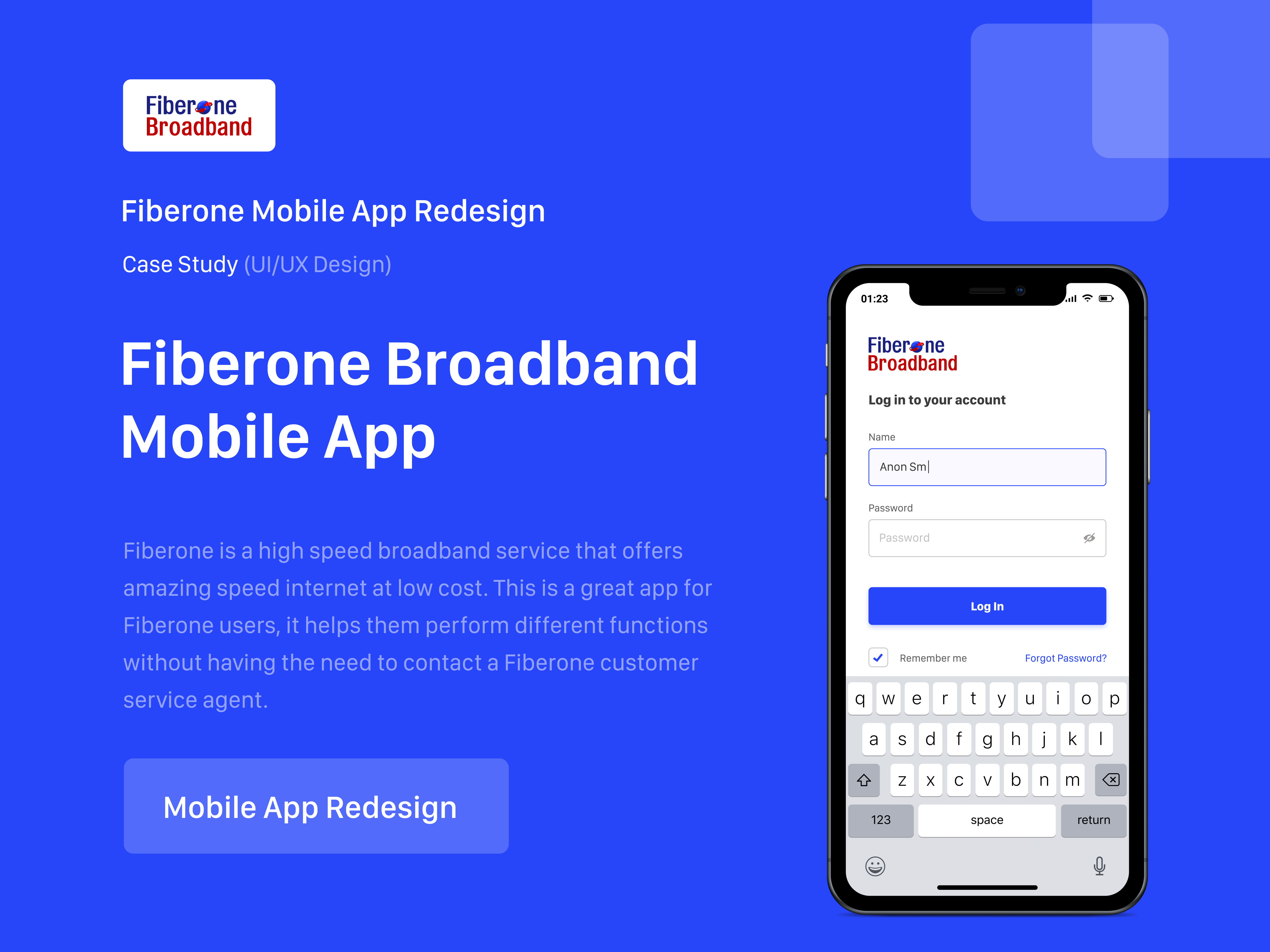
Overview
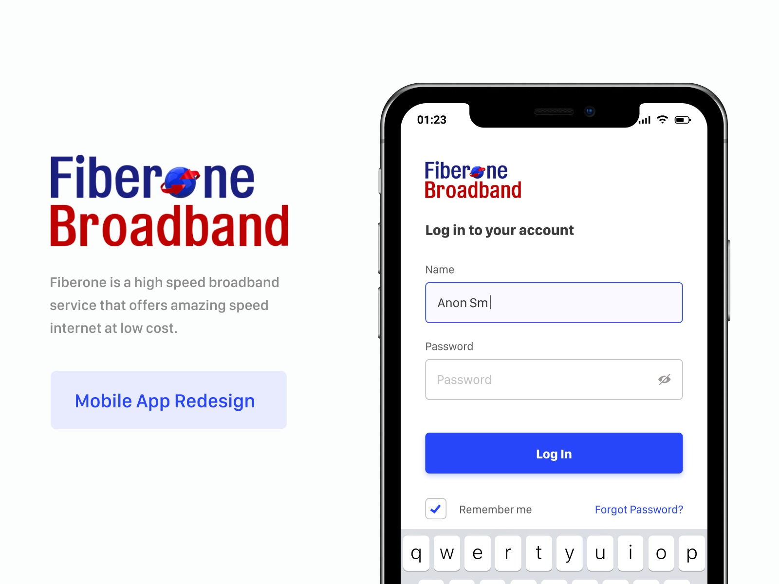
FiberOne is a high-speed broadband service that offers amazing-speed internet at low cost. Their app should let users do everything a broadband customer needs: check usage, renew plans, pay bills, and get support, without ever picking up a phone. It didn't.
The existing app had unclear navigation, unlabelled icons, a punishingly long renewal flow, and a customer support path so confusing that users called instead of using it. I redesigned the experience end to end.
The Challenge
When I researched and tested the existing app, the issues weren't subtle:
- The navigation was unclear.
- There were lots of icons without labels.
- The renewal process was too long.
- It was always difficult to do basic tasks.
- Reaching out to customer support was confusing.
- Information architecture was wrong, it was all over the place.
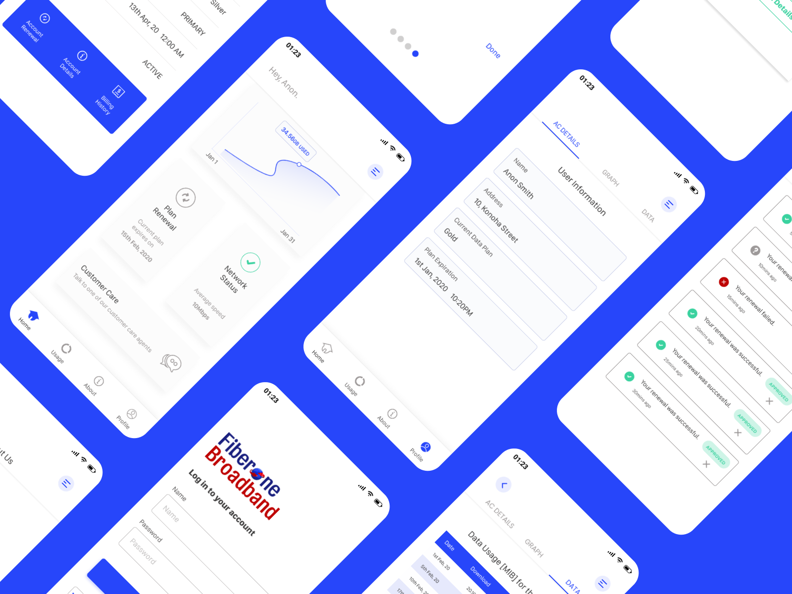
What I Fixed
- I fixed a navigation tab at the bottom with clear icons.
- I used new icons and added labels to avoid guessing.
- I simplified the renewal process to a minimum number of steps.
- I redesigned basic tasks and made them simpler and fun.
- Reaching out to customer service was made clearer and easier.
- Information was arranged better, it made the app easier to understand.
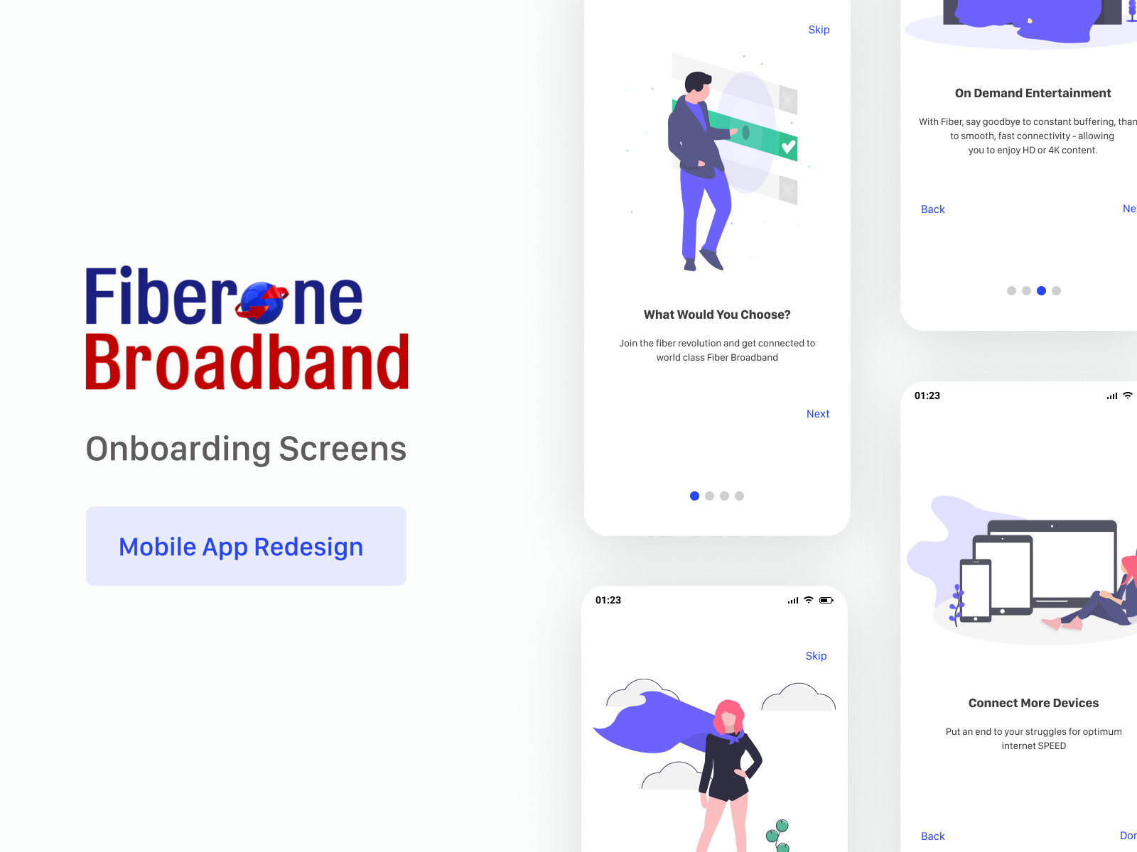
Design Process
I followed a deliberately structured process: Identify the problem → Research and Frame → Brainstorm → User Flow → Low-fidelity mockup → High-fidelity design → Prototype and Test.
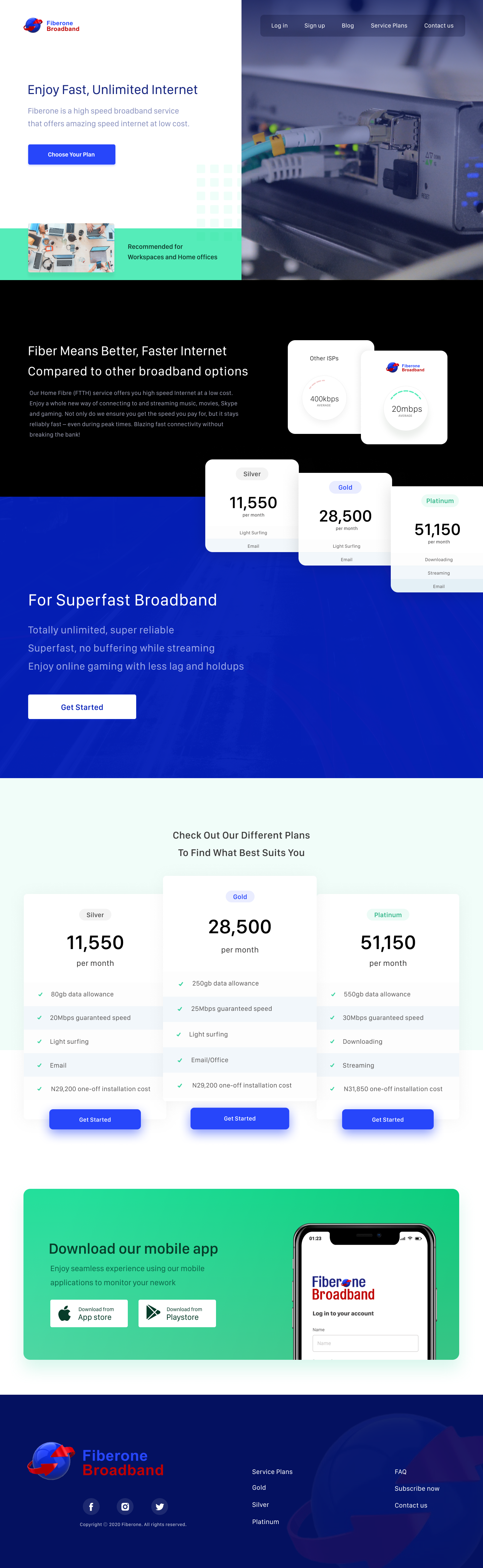
Website Redesign
The same product, on every surface.
The website was redesigned alongside the mobile app to share visual language, copy voice, and information architecture. Customers landing from a Google search should feel they're in the same product as the customers who downloaded the app.
My Approach
I focused on a clearer navigation structure, a shorter renewal journey, and a more human support experience so the app felt easier to use and more trustworthy.
Anchor the experience with clear navigation
Implemented a fixed bottom navigation with labels so the app felt predictable and users could move between billing, support, and account sections with confidence.
Turn renewal into a visible goal
Moved plan renewal onto the home screen as a dedicated flow, making the task obvious and reducing the steps needed to complete it.
Make support feel human and accessible
Redesigned customer care wording and flow so users felt supported rather than lost, turning support into a usable product feature.
What I Learned
Listing the problems is half the work
I started by writing every single thing wrong with the existing app. I now do this exercise for every product I inherit the act of enumeration surfaces patterns you can't see when issues stay in your head.
The most-used flow deserves the most attention
Subscriptions and renewals are the boring, repeated, every month or weekly tasks. They are also the highest stakes UX moments in a broadband product. The hierarchy of attention should match the hierarchy of use.
Tone is a feature
"Talk to one of our customer care agents" isn't decoration. It's the difference between a user trying the path and a user calling support. Microcopy is a product decision.