The Context
Designed for the people who use HR software every day.
HRMP was a design assessment to build out a full HR management platform, a category traditionally defined by clunky enterprise software that HR teams tolerate rather than enjoy. The brief was open: design something people would actually want to use daily.
I designed the entire experience from discovery through to prototyped high-fidelity screens, including directories, org charts, team views, leave request workflows, and a recruitment pipeline.
The Challenge
Make HR software feel calm.
HR tools have a reputation problem
Most HR platforms are built for compliance first and the people using them second. Dense tables, tiny buttons, opaque workflows. Daily users, managers approving leave, HR coordinators tracking applicants, disengage from them as fast as possible.
Density without clarity
HR data is genuinely dense, hundreds of employees, dozens of teams, ongoing requests, recruitment funnels. The challenge isn't reducing the information. It's making it feel scannable rather than overwhelming.
What customers actually needed
HR platforms often get a free pass on usability because they're considered "enterprise tools." I disagreed with that assumption. The people using these systems every day deserve the same level of care and thoughtful design as consumer products, especially because their jobs become significantly harder when the software creates friction instead of removing it.
Through my research, I realised that users weren't asking for flashy features, they wanted the boring stuff, done well.
- A daily home view that highlights what actually needs attention today instead of overwhelming users with dense dashboards and unnecessary data.
- Employee discovery through multiple perspectives: directory, org chart, and team views, allowing the same information to adapt to different workflows and mental models.
- A leave management flow where request status, approvals, and next actions are immediately understandable for both employees and managers.
- A recruitment workspace where candidate context lives alongside the actions recruiters need to take, reducing unnecessary navigation and cognitive load.
Home screen
A dashboard, not a data dump. The home screen surfaces tasks first: leave requests in progress, employees out today, quick actions for adding staff. Everything secondary is one click away. The greeting is personal because the platform should feel like it knows you.
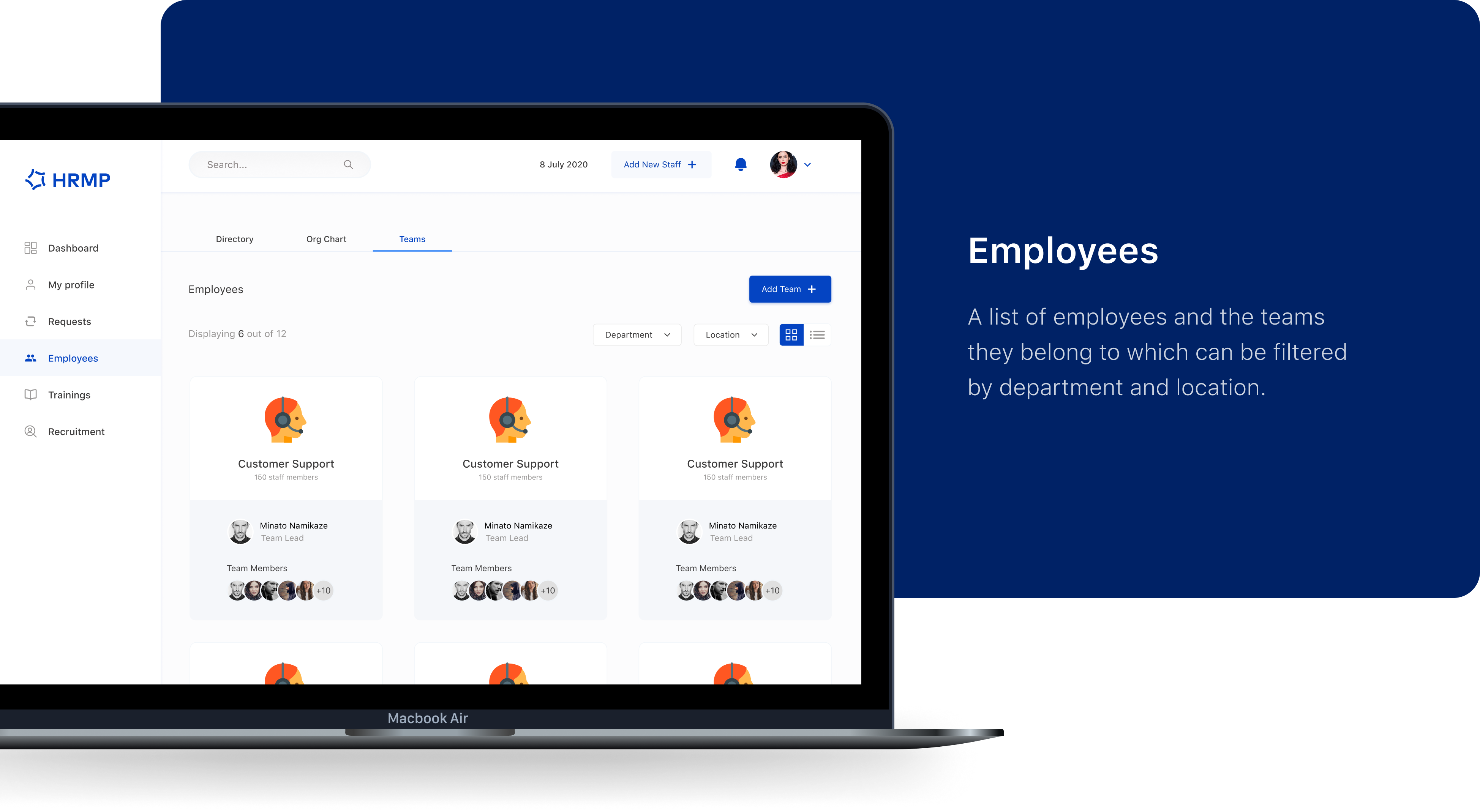
Employees
Three views of the same truth. Different roles need different shapes of the same data. A new manager wants the org chart. HR ops wants a filterable directory. Project leads want team groupings. I built all three as tabs over a shared dataset, filterable by department and location.
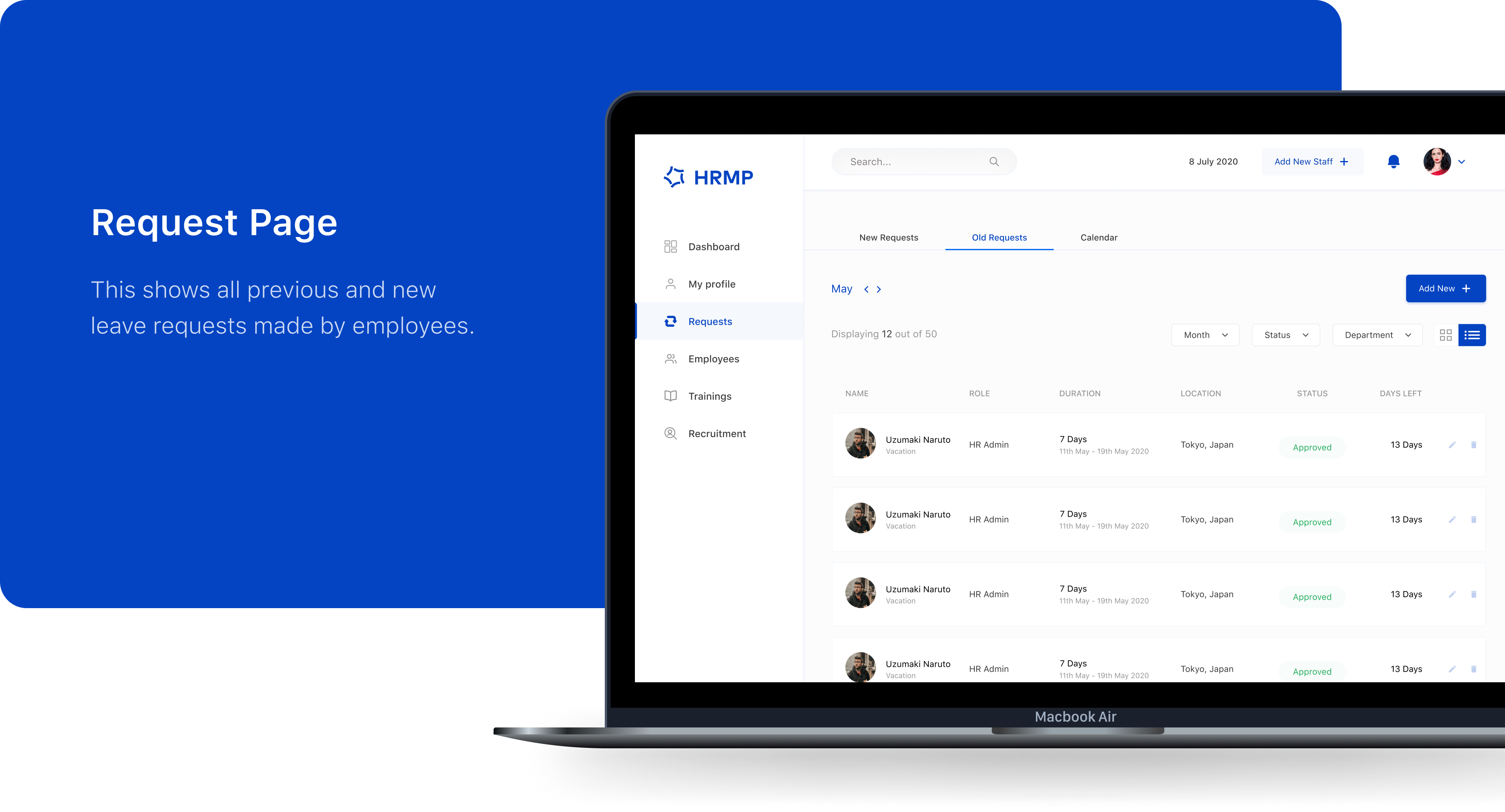
Leave requests
Status, legible at a glance. The request page handles all previous and new leave requests with three tabs (new, old, calendar) and filters by month, status, and department. Status pills use colour sparingly, green for approved is the only saturated colour on the page.

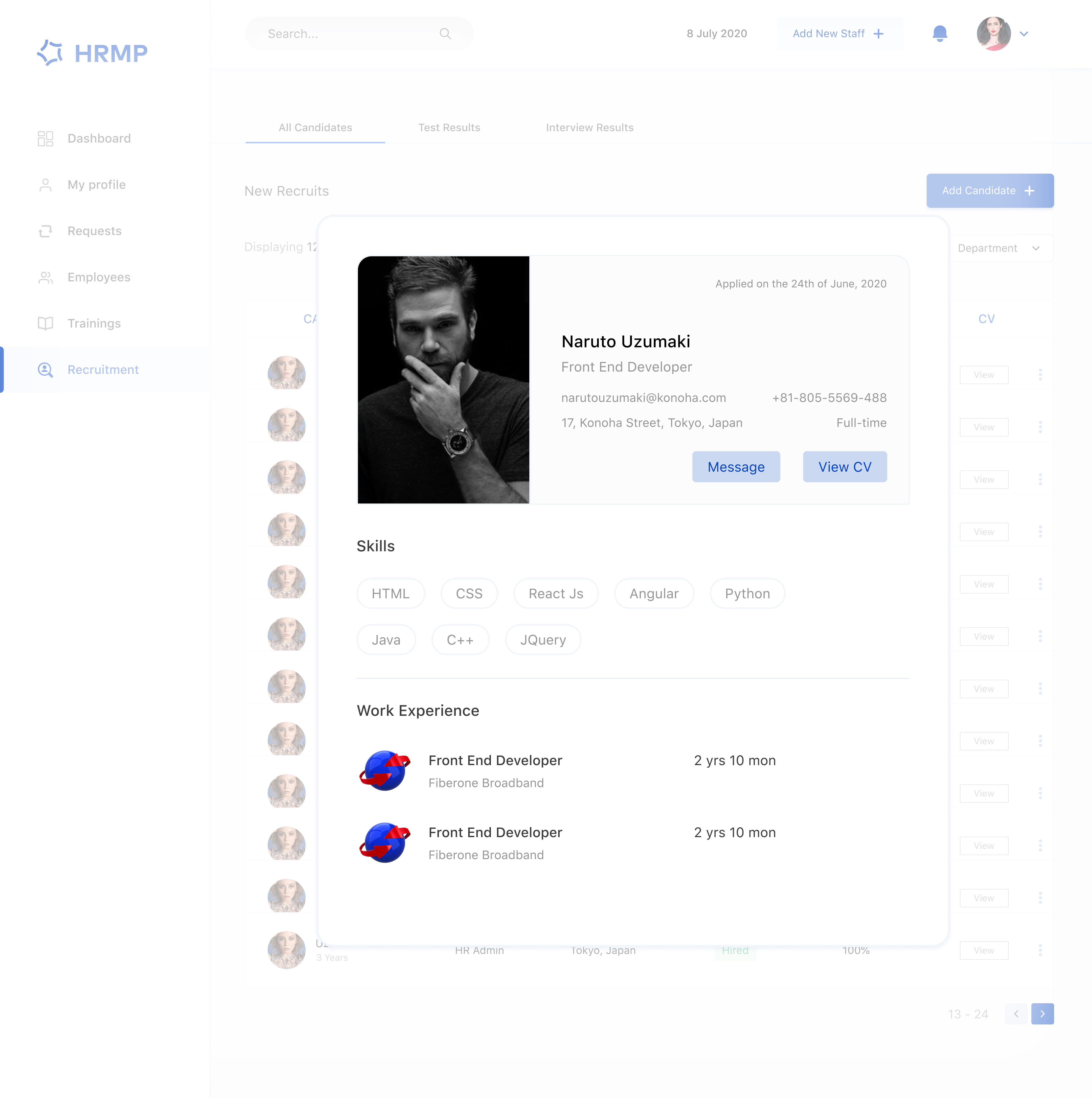
Recruitment
Candidate context next to the action. The recruitment view surfaces candidates with all the context an HR coordinator needs to make a call, skills, work experience, contact details, CV, in one panel. Message and View CV are the only two primary actions, because in this moment that's all that matters.
My Approach
Design system first
Before designing individual screens, I established the foundational design system: colour, typography, and spacing tokens. Once the system was in place, creating consistent screens became significantly faster and more scalable. Without that foundation, every screen risks reinventing the basics.
A single signature colour
I anchored the visual identity around a deep blue palette, supported by neutral whites and greys. Stronger, saturated colours were intentionally reserved for moments where status, urgency, or feedback genuinely needed attention.
Generous whitespace
High-density information doesn't have to feel overwhelming. I intentionally used whitespace to create clarity, guide attention, and reduce cognitive load. HR tools manage complex workflows, but the interface itself shouldn't feel crowded or exhausting to navigate.
What I Learned
Information architecture is product strategy
Deciding what becomes a tab, a filter, or a standalone page is one of the most important decisions in enterprise product design. Strong IA reduces friction, improves discoverability, and makes complex systems feel intuitive.
Different views of the same data can become a product advantage
Directory, org chart, and team views weren't separate features, they were different representations of the same underlying dataset. Recognising this helped create a more flexible and scalable product experience.
Enterprise users deserve consumer-grade experiences
The idea that internal tools can sacrifice usability because they're "just enterprise software" leads to poor product experiences. People spend a significant part of their day inside these systems, and thoughtful design has a direct impact on productivity, clarity, and satisfaction.
HRMP is a design assessment, a portfolio piece, not a shipped product. I included it because the design thinking, system, and prototype work are genuinely representative of how I approach enterprise UX problems.